First, I want to say how great the jazz scene is in New York. I caught a little Latin at my go-to Guantanamera last night, but the band seemed to be phoning it in a bit, so I walked over to Dizzy’s and heard an amazing big band performance by the Diva all-women Jass Orchestra, they had Clint Holmes leading vocals and I got Frank Sinatra / Count Basie vibes, so great to see such a tight big band.
I’m in New Orleans for the first time in 7 years for a beautiful wedding. My Mom’s side of the family emigrated here in the 1860s, and there’s a deep comfort in the art, traditions, and weirdness of Creole culture. Good music and food are ubiquitous.
Afterward, we went to see my friend Troy, aka Trombone Shorty, at his studio. (Troy and I met when we both received the Heinz Award in 2016.) He was with Silkk the Shocker and Reggie Nicholas Jr., working on beats and songs. Though I was there for just a short while, it was inspiring to see the act of musical creation.
A few days ago, Ed Sheeran went on the new Benny Blanco / Lil Dicky / Kristin Podcast Friends Keep Secrets. I haven’t watched the entire episode, but the twenty minutes from about 1:09 to the end where Ed and Benny come up with a new song I’ve seen 4 times now, it’s magical. Check it out, it’s one of the coolest things you’ll see this week.
Kudos to WP community member Matt Medeiros, who used AI to spin up a quick webapp to help his community track which streets had been plowed after that crazy snowstorm. Making local communities better is definitely part of the WordPresser ethos.
I want to start by thanking the Automattic board, and in particular General (Ret.) Ann Dunwoody, for encouraging me to step away from the endless work of being CEO of Automattic to focus on training and development. Ann, as one of this generation’s great leaders, did it herself before recommending it. She took the course shortly after becoming a four-star.
As I reflect on all the corporate training I’ve had, from the first class they made me take at CNET 22 years ago because my title had manager in it, to the workshops or intensive CEO things I’ve been lucky enough to be exposed to later, there’s one thing that really stands clear: You get out of any program what you put into it.
If you come in skeptical, distracted, or resentful, even if golden information is being dropped, it will bounce off you like water on a duck. You have to put yourself in a state of mind of extreme openness and enthusiasm, and take an earnest try at what the facilitators have designed and planned, no matter how cheesy, corny, obvious, or silly it might seem. Remember, their intention is for you to get something out of this, and they’ve done it before.
Holding that state of openness is also a catalyst for the teacher; they light up when students are willing to trust the process, and they’ll give you their very best. I originally titled this post “Complete Surrender” because that extreme statement helps me step out of the part of my mind that is always trying to challenge authority, remix conventions, or think I’m cleverer than others.
These programs are usually expensive, not just in dollars but in time you have to clear from other commitments, so don’t squander it by staying in your default modes of checking work, news, etc. Create a space for yourself to reflect, learn, and grow. It’s rare and precious.
The caveat, of course, is to choose your teachers well. CCL has been doing this since the 70s; they’ve figured a few things out. They’re Lindy. All of these programs change and evolve over time; they’re not carved in stone, but it’s particularly interesting to see what survives when something has been going on for a long time.
I’m also not religious about these things. I think of them as mental models that are new arrows in your quiver. You can use them as is, or, even better, mix them with something else you’ve learned to create something more useful and personalized to your context. The more you have, the more sturdy your latticework of understanding is, and the more robust your information framework will be when you encounter something novel.
There’s also some luck in the group; a bad apple can throw off the week for everyone. My cohort had people from a variety of industries like healthcare, paper products, car rentals, and business process outsourcing from all around the world, including Egypt, Brazil, Saudi Arabia, and all across the US. It would have been easy for people to be guarded, but everyone really leaned in. I think we had so little network overlap that people felt more comfortable opening up. And, of course, it was endlessly fascinating to learn about the challenges across vastly different industries, as well as the universal commonalities that arise whenever you try to vector a group of humans towards a common goal.
One of the inspirations I drew from Ann’s book, A Higher Standard, was the extent to which the Army invests in training and development, sometimes sending people to programs for years before they move into a new role. They’re always thinking about the next generation.
A big theme for me in 2026 is learning: Last month at Automattic, we did our first two-week in-person AI Enablement intensive at our Noho Space, and the feedback was incredible. On the WordPress side, this year we’ll have thousands of college students enroll in our new WordPress Credits program to earn credits toward their degrees. The number of cities where WP meetups are held is on track to double; it’s clear people are hungry for opportunities to learn and grow.
People have been asking my takeaways from the course, and it’s been hard to summarize, but I came away with big lessons on how my comfortable and improvisational presentation style can come off as not having a solid plan or being prepared, the importance of exercise and nutrition to have the energy you need as a leader, and the importance of being on time and what that signals to others. Great feedback is a gift and a mirror, allowing you to see things you might miss about how you show up to others. In the course, we made plans, and since then, I’ve been experimenting with integrating these learnings and others into my day-to-day. I feel like it’s really had an impact.
So in closing, when you’re a busy executive, there’s never a good time to step away for a week, but I highly encourage every leader to at least once a year invest in themselves and let your colleagues and loved ones know that for a few days you’ll be really focused on a departure from your quotidian day-to-day and work on growth. It’s hard but worth it.
One of the most concerning trends I’ve seen is that, as people adopt AI, it captures those for whom it was designed. That previous sentence went through several revisions at various layers of intelligence… the spell-checker, grammar-checker, Grammarly, Harper, maybe more, all attacking the words that spill from my divine intelligence and then interact with yours.
i expect ai to be capable of superhuman persuasion well before it is superhuman at general intelligence, which may lead to some very strange outcomes
Some very smart and talented friends are going down rabbit holes that don’t have good ends. My world is small; when you extrapolate this out to the 800M+ MAUs of ChatGPT, there’s probably a lot of weird stuff happening out there. We live in the most interesting times.
One of my favorite travel hacks is finding the Neapolitan pizza oven in the airport, as there’s nothing quite like a fresh pizza sizzling on your plate.
At Houston Intercontinental, which I know like the back of my hand, there was a divine experience at the C Gate nexus at Forno Magico, especially in the morning, when they offer a bacon, egg, and cheese pizza that I would beeline for whenever I had a morning flight. It’s big enough to feed two.
That said, I am disappointed to report that Forno Magico is no longer magical. They stopped salting the oven floor or rotating the pie, and the eggs were sloppily bunched. The dough was dry; it was like they’d never had a good pizza. They’re only heating the oven to 498, not the 905 recommended by the Associazione Verace Pizza Napoletana. It was edible but not a delight, as you can see here.
I hope they rediscover the art of firing pizzas they started with. They’re charging over $20 for it, so plenty of margin for fuel. It would also serve customers much faster! I’ll keep searching for great pizzas in other airports.
“That depends on the length of the speech,” answered the President. “If it is a ten-minute speech it takes me all of two weeks to prepare it; if it is a half-hour speech it takes me a week; if I can talk as long as I want to it requires no preparation at all. I am ready now.”
Jetpack is frequently overlooked as one of the most underappreciated plugins in the WordPress universe. This is partially our fault, as the article notes, because the UI for some of these settings is quite poor. We’re working on it! If you can tolerate a bit of UI clunkiness, there’s significant value to be gained from Jetpack right now. For everyone else, we’ll make it much more intuitive soon.
I have two interesting interviews to share with you today, the first is Lex Fridman interviewing Pavel Durov, the founder of Telegram. I started using and advocating for Telegram back in 2015, and Audrey Capital was part of their aborted fundraise in 2018. As a software craftsperson, I’ve always had tremendous respect for the team and the rate at which they shipped truly novel design and UI. I’m amazed by the speed at which they ship major features across multiple platforms. The network also has incredibly resiliency, which they get into on the podcast. As I’m often in poor connectivity situations in planes or remote locations, Telegram has been one of the networks that works most reliably.
I’ve met Pavel only briefly about a decade ago, but have followed his story as he’s a unique character with an ascetic lifestyle, target of many intelligence agencies, sperm donor father of 100+ children, and many other unique characteristics. I use Telegram like I use X/Twitter, I put things I consider semi-public on it and I think of it like a social network and development platform, and since 2022 I’ve cross-posted my blog to a Telegram channel using a Jetpack bot. It’s probably my favorite community platform. The four hour interview between Lex and Pavel covers a lot of ground, but product builders will probably appreciate most the middle part around the 2-hour mark where they go into their engineering and design philosophies. (BTW I usually watch/listen to these at 2x speed.)
I know this seems like an unusual pairing, but both Pavel and Weird Al are hackers in the sense that they examined the rules of the system and decided to create a new game.
I learned today from the Newspack newsletter that the Houston Press is now on WordPress. Newspack is a distribution or bundle of WordPress designed for journalism, and it is led by Kinsey Wilson, who began his career as a night-shift journalist covering cops for a newspaper in Chicago, went on to have top editorial and business positions at The New York Times, NPR, and USA TODAY, and ran WordPress.com for a few years, which gives him a very unique position to help craft WordPress for journalists and publishers.
The Houston Press is an alt-weekly that wrote the very first profile of me in the world, which I blogged about here. There’s a funny quote in there:
He recently considered taking a job with a San Francisco search-engine start-up, but ended up turning them down. “They have a ton of money…But it would be 50- or 60- or 70-hour weeks, a lot of work, and I wouldn’t have time” to do WordPress.
That “search-engine start-up” was Google! How the internet might have turned out differently if I had taken that job, as my Mom wanted me to (because they offered free food). I still think Google is one of the most interesting companies in the world, one of the few places I’d consider working if I weren’t running Automattic.
Back to linkrot, the original link to the profile in that article was http://www.houstonpress.com/issues/2004-10-28/feature2.html, which this morning didn’t work, but thanks to the Houston Press being on Newspack/WordPress I was able to ping Kinsey and his colleague Jason Lee was able to fix it so it redirects to the new canonical URL for that content in minutes. A little corner of the internet tidied up! I love the Wayback Machine, but not needing it is even better.
I want to dedicate my blog post today to my dear friend and brother, Om Malik, whose birthday it is. Om is a multi-hyphenate, but at his core, he’s a writer, someone who looks at the world and parses it down for others, a seeker who appreciates the spark of creation before most others.
Om was one of the earliest users of WordPress and he was one of 8 people who came to the very first WordPress meetups at Chaat Cafe on 3rd street in San Francisco in 2005. (You can tell what an early adopter he is because he has the username “Om” on Twitter/X and Instagram and WordPress and probably more.) We had connected on the WordPress support forums when I helped him get set up around the 1.0 days. After I moved to San Francisco to take the job at CNET he connected me to people like Phil Black, Tony Conrad, and Toni Schneider who would become, respectively, an investor, board member, and CEO of Automattic. These are folks I still work with and consider close friends today. As a journalist, he had a keen nose for BS and made sure as a naïve 20-something in SF I was connecting with quality people.
Over the years, we’ve dipped in and out of shared obsessions with cameras, watches, shoes, fashion, and design. We have a fair number of matching things in each. In photography we’ve shivered in minus thirty weather in Antarctica and Jackson Hole at odd hours to catch a special shot. We’ve traveled to Europe and Japan dozens of times, being very early (pre John Mayer and Kanye) to brands like Visvim. When I wear something like a bespoke, hand-made piece from 45R to speak at WordCamp US, he recognizes it off the cuff and even knows the one store on Crosby Street in New York where you can buy it. He is a tastemaker and an aesthetic connoisseur in every area he’s interested in, from food to coffee to pens, and everything in between. Sometimes we’ll start a journey together, for example, trying nice pens, and years later, I’ve moved on and he’s gone deep into collecting dozens of them, being in obscure forums and Reddits, or attending events like the SF Pen Show last month.
When you walk into a coffee shop with Om he doesn’t just know the barista’s name, he knows their dog’s name and the story of every person working there.
I’m 500 words in, and I still haven’t even scratched the surface of describing Om’s journey, from growing up in Delhi to becoming a journalist for a Japanese publication in New York, a book author, party promoter, entrepreneur, venture capitalist, photographer, and explorer. If you want to understand the AI bubble we’re in right now, you should read his book Broadbandits on the crazy telecom / Enron bubble. This is a long way to say, happy birthday Om!
This really gets to my vision for Gutenberg to be a builder that anyone can use to create an incredible website, like legos anyone can assemble anything they imagine on the web. This is why I said Gutenberg is bigger than WordPress.
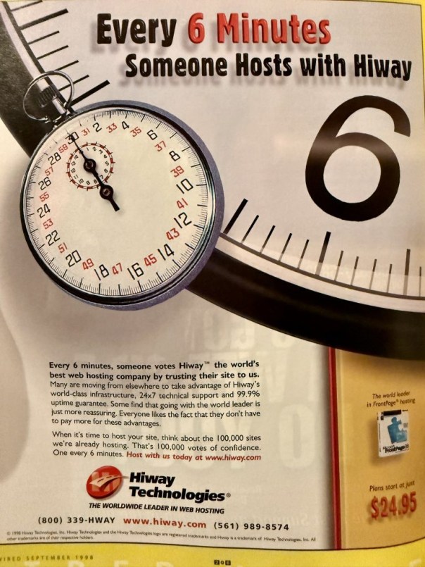
I’m at a dinner tonight and they have these old magazines on the table, including some old copies of WIRED, which, if you can imagine, as a kid in Houston in the 90s, was a portal to the amazing world of the internet and technology. I flipped through, and there is an entire web hosting classifieds section! Hiway Technologies wants you to know that every 6 minutes, someone hosts with Hiway.
Every six minutes, so they were doing 240 signups a day. 100,000 sites! Last month WordPress.com created a new site about every 3 seconds. Hiway was founded by Scott Adams, same name but not the Dilbert guy or the game designer, who apparently played football in Florida and the company “was sold in 1999 for $352 million. Adams was 35.”
There was also this guy, who has a website, but do you?
I recently came across a few old business cards I designed back in 1999. The first ones were for my services as a saxophone player:
A few notes:
I went mostly by “Matthew” then.
At some point I decided to remove the home address and say that I was available to play not just alto saxophone but baritone, tenor, and soprano as well.
The number was the home shared house number, not a cell phone.
The email was an email address the entire family shared, under my dad’s name.
HAL-PC was an amazing non-profit local to Houston that stood for the “Houston Area League of PC users.” There was a pretty reasonable annual membership fee, and they hosted a monthly general meeting which had hundreds of attendees, always with a presentation or two and a raffle giveaway at the end. They were a dial-up ISP and BBS/newsgroup host. I volunteered for them by going in on Saturdays where they had a room people could bring their broken computers to and get free tech support, and by hosting a SIG, or special-interest group, around PalmOS called HPUG, the Houston Palm Users Group. This was a big part of the inspiration for WordCamps.
This was for my “design” business:
I would also design business cards for friends, here’s one for my friend who was a percussionist and vibraphonist, Chase Jordan:
Well, thanks to the magic of AI, I asked the Nano Banana AI Studio to “make it so on the bottom one person raises their hand,” and it didn’t work at first. So, I tried a few other variations, and then, voilà!
Technology is amazing. And now we have a counter to the meme. Be that one hand that raises.
Although this is a joke, I’m going to give humanity a high-five because, compared to when I started in technology, which was more the Microsoft Halloween memo era, to where we are today, I’m so impressed that so many makers, creators, designers, engineers, and leaders have adopted the moral framework of open source being part of their calling. Businesses, too! I used to get laughed out of the room or had spears thrown at the security of open source, but that is no longer a blocker, and the conversation has really elevated. It doesn’t feel like one person raising their hand anymore; it’s grown into a truly special movement, a lens through which you can view almost anything.
Open source is the best way we have to set the foundation for future generations to build upon, ensuring the light cone of humanity’s technological expansion becomes something that belongs to all of us, not just a few.
WordPress.com offers two modes of WP: WordPress and WordPress MS. For free and lower-priced accounts it runs a version of WordPress called WordPress MS, or WordPress Multisite, which is designed for super-efficient multi-tenant usage, which is what has allowed it to introduce hundreds of millions of people to WordPress and run at a huge scale. (It was initially called MU, for multi-user, but we had to change it because someone squatted the name WPMU and built a business on top that was confusing users with commercial products. Such is my curse.) It revolutionized the hosting industry in a number of ways, including acclimating customers to per-site pricing instead of unlimited domains and raising the bar for what a host would manage for users so they didn’t have to worry. It has also provided a highly secure base login, which allows us to offer popular SaaS services, such as statistics and anti-spam, to all WordPress users, regardless of where they’re hosted.
At higher-priced plans you’d get access to not just a curated set of plugins and themes but the ability to install anything you like from the ecosystem, which invisibly switches your account to WP.cloud in the backend that supports unlimited plugins and themes and custom code, in a way that’s still multi-datacenter and maintenance-free. This has been very successful and works great for a ton of customers, but it still puts an asterisk when you recommend WordPress.com to someone because they’d need to be on one of the higher-priced plans to get an experience of WordPress with custom plugins and themes.
For the first time ever we’re running a summer special where every single paid account gets that full WP.cloud experience with full customization and control. It’s a test we’re running until August 25th. It’s WordPress, without the asterisk, without limits, implemented in a way that’s intuitive and safe for novice users, while also being extremely powerful for developers. If you haven’t checked out WP.com in a while, it’s a great deal starting at just $4 per month. I’m curious to see the results of how this goes. We also have a number of more radical things I’m eager to try out! It’s a great time to reimagine what you’re doing from the ground up and question your longest-held beliefs, as AI has really put people in a more experimental and open mindset.